
Genesis I: “The earth was without form and void; and darkness was upon the face of the deep. And God said, let there be light, and there was light.”
The above statement was a short quote made by Barnett Newman on his first Zip paintings, sometime between 1946 and 1948. The son of Polish Jewish immigrants, Newman is now considered to be one of the founding fathers of Minimalist Art. Despite that he was also associated with Abstract Expressionism, Formalist Abstraction and Color Field Painting, he insisted that he was independent of any school of thought, and that his work is neither objective nor non-objective. What counts the most is the experience that one would receive when standing in front of his large scale works. We present you in this article a retrospective of this artist giant!

“(1946) Barnett Newman. Untitled I. 1946.jpg”
Strangely, Newman had destroyed all his work that predated 1944. Yet, Untitled I (1946) and Genetic Moment (1947) represent a glimpse of how his initial style appeared to be. In his abstract expressionist style of Genetic Moment (1947), Newman searched in Surrealism for the most economical processes: biomorphism and automatism. Those processes allowed for a ‘creation of worlds’ in rapid gesture to stage the primal archetypes and forms of the living organisms: the spermatozoa. Nonetheless, this painting’s rich content could symbolically represent the birth of the art of Newman. On the other hand, Untitled I (1946) seems to be a downgrade of Newman's spermatozoid forms. Its linear forms complement the depicted lines in Genetic Moment (1947). However, those linear forms in Untitled I (1946) appear to be standalone, just as in the middle of void, right before an automatic biomorphic genetic moment could occur. They could ultimately be as well bands or ‘zips’ of light that illuminate the world upon the creation of life.

“(1948) Barnett Newman. Two Edges. 1948.jpg”

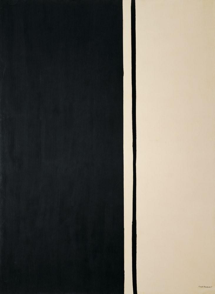
"(1948) Barnett Newman. Onement, I. 1948.jpg"
Indeed, Newman’s earliest works mark a biomorphic beginning of the creation of his artistic oeuvre. In a later year, Newman created his artistic breakthrough with the painting Onement I (1948) to which he had stated once in an interview that this painting particularly made him feel that he had moved into an area that was completely himself. Earlier to this painting, Two Edges (1948) represented vertical brands that appeared to be illuminating the atmosphere, as if those bands were the observant light in nature. However, Onement I (1948) achieved an artistic and humanistic enlightenment. Its vertical band of ‘light’ appearing in the center showcases the orders of God when he had asked, “let there be light”. In contrary to Two Edges (1948), Onement I (1948) presented Newman with a more immediate organic effect that was rather emotional than rational, and that is all while being depicted as a single vertical zip at the center of the canvas. Therefore, Onement I (1948) represented the human experience that would have been during the creation of the world or the universe (or multiverse?). It was nonetheless the ultimate human feeling.

“(1950) Barnett Newman. The Wild. 1950.jpg”
Moreover, this vertical band or zip in Onement I (1948), and while it was earlier depicted by Newman in other works, would eventually become his signature style for the rest of his artistic years. In a revolutionary depiction and instance of Newman’s own zip, he presented it later in just a one-and-a-half inches-wide canvas entitled The Wild (1950). Looking like a piece of sculpture, Newman had presented the zip as a rebel or a ‘wild one’, like an independent vertical living being or light that is fit to stand freely and observe its divine presence and ritualistic creation, just as the zip in Onement I (1948) had equally achieved.

“(1949) Barnett Newman. Argos. 1949.jpg”

“(1949) Barnett Newman. By Twos. 1949.jpg”

“(1950-1951) Barnett Newman. Vir Heroicus Sublimis. 1950-1951.jpg”
Furthermore, while Newman’s earliest works had also showcased color fields that were variegated, his later depiction of color became pure and flat, just as those of Argos (1949), By Twos (1949) and Vir Heroicus Sublimis (Man, Heroic and Sublime) (1950-1951). In the latter artwork, Newman questioned “If we are living in a time without a legend that can be called sublime, how can we be creating sublime art?”. While this painting was the largest of his creations at the time, measuring 242.2 x 541.7 cm, it interestingly had the same height as that of his earlier sculpture-like painting The Wild (1950). Like a metaphysical encounter, the audience would stand amass of Vir Heroicus Sublimis (Man, Heroic and Sublime) (1950-1951) and experience a meaningful meeting with the painting, which could alter those audience’s lives just as those vertical beings’ lives in the painting would embark on their own creational change – or metamorphosis?

“(1951) Barnett Newman. Cathedra. 1951.jpg”

“(1952) Barnett Newman. Achilles. 1952.jpg”
“(1952) Barnett Newman. Prometheus Bound. 1952.jpg”

(1953) Barnett Newman. Onement VI. 1953.jpg”
Additionally, and while keeping himself loyal to his painterly style of ‘zips’ alongside their profound concept as presented in Onement VI (1953), Newman later began implementing a much deeper content: one that is highly religious and culturally rich. In these further works, he referred to the artist as the ‘first man’, and therefore his painted zips are those vertical or horizontal linear signifiers of human presence in the world, while this abstracted human is profoundly demarked as the light of creation, the product of light, and the worldly creator. This is why Newman began to bridge a closer relationship between human prehistory and the present by entitling many of his works with biblical and mythological titles, such as those that represent moments of great first beginnings, or even names of cultural heroes. This is therefore evident in Argos (1949), Cathedra (1951), Achilles (1952), and Prometheus Bound (1952). This is even evident in a work that is uniquely titled as By Twos (1949) because it represents the animal pairs who survived the Flood in Noah’s Ark. The painting could even be a melancholic reference to the tragic history of the Jews of Europe or even to those in prehistory.
“(1961) Barnett Newman. Black Fire I. 1961.jpg”
Furthermore, Newman once said, “I try in my titles to evoke the meaning that the painting had when I was painting it”. Given this statement and complementary examples such as White Fire II (1960) and Black Fire I (1961), the universal dualities of existence take form in those works with the aid of the visual element of color, where white light appears to be contrasted with darker light. Those dualities could further represent the of light of creation and of form, as well as the darkness of destruction and of formlessness. Moreover, the painting Black Fire I (1961) refers to that of which the Torah (the law of God revealed to Moses) was originally made from. And, while the title deceives the audience that other versions of Black Fire do exist, Newman had created none other than Black Fire I (1961), making this painting entitled with a unique painterly expression by Newman. On the other hand, the fire in White Fire II (1960) refers to the written Torah, and so the black fire would more simply refer to the oral Torah, signifying the earlier universal duality explained in title and in color (or light). Nonetheless, the titles of White Fire II (1960) and Black Fire I (1961) also reveal historic Jewish tragedy, and while their creation is abstract in nature, Black Fire I (1961) for an instance was created during the year of the Nazi Adolf Eichmann’s publicized trial which brought to light the atrocities of the holocaust. Therefore, Newman entitled his works with careful content and symbolism, referencing at times the events that took place during those paintings’ years of creation.

“(1962) Barnett Newman. The Third. 1962.jpg”

“(1965) Barnett Newman. Triad. 1965.jpg”
In The Third (1962), Tertia (1964) and Triad (1965), Newman seemed to have created a tertiary canvas collective that are related in color, but not entirely in form. While the zips and the bands vary in dimensionality in all three paintings, the titles again signify a spiritual meaning. This is albeit that Newman had not provided an explanation himself to those paintings. If thinking like Newman could explain to us that the stripes and the orange field elements are identified respectively as humanity and nature, then the three artworks could be explained as a declaration of the human’s nature against Nature. The third element in this tertiary series, and while being quite difficult to decipher by just referring to it as the white area upon which gestural marks had been painted, one could conclude that this third element could be divinity. This generalization would make it in line with Newman’s religious abstract representation in his overall oeuvre of work. Hence, Newman is expressing in this artistic creation a triad of humanity, divinity and nature.

“(1963-1967) Barnett Newman. Broken Obelisk, near Rothko Chapel. 1963-1967.jpg”
Furthermore, Newman embarked on a new art medium in the mid-1960s: sculpture. His Broken Obelisk (1963-1967) exists in four multiples. The one pictured is the one installed near the Rothko Chapel in Houston (Texas), USA. Nevertheless, and while the sublime could lay less in nature than in culture, Newman was devout to express his meditation on Ancient Egypt through his Broken Obelisk (1963-1967). It is a pyramid with an inverted obelisk rising from the pyramid’s apex like a beam of light. While cultural associations of pyramids and broken columns are a reference to death, Newman upgrades their definition and transcends them towards a meaning of life-affirmation. Moreover, Here III (1965-1966) was another sculpture created by Newman during this same period. Its title refers to a metaphysical set of implications about place where it lies as the ground of difference between the lonesome human and the nonhuman surrounding, especially in terms of spatiality and distance.

“(1967) Barnett Newman. Voice of Fire. 1967.jpg”
Later, in 1967, Newman was commissioned by the U.S. Pavilion representation of Expo 67 to create one of his greatest vertical canvases ever: Voice of Fire (1967). It measured 540 cm × 240 cm. The title of the artwork was taken from the biblical announcement of God’s presence to Moses and the Israelites on Mount Sinai. While Newman was a spiritual man, his choice of title may be akin to his loathing towards the American involvement in the Vietnam War. Thus, the painting is a protest by Newman, as if he is indicating God’s presence as the all-witness of the inhuman atrocities committed during this war. Perhaps too, Newman had indicated that God is the strongest voice of truth and justice, bringing the fire as punishment to all the Vietnam War’s criminals. And, while presenting the painting patriotically in the American flag’s red and blue, it confronts the audience’s patriotism in pure majestic form and color, and while it hanged at the U.S. Pavilion then to mark the contemporary art and the spirit of the age, it was nevertheless intended to appear at the pavilion as an environmental irony alongside symbols of American progress, such as an Apollo capsule. While the painting declared a strong humanist statement, that the war was nothing progressive to the Americans and to the world, it was then an indication of the declination of the purest form of American values: humanity. Therefore, the painting Voice of Fire (1967) could be interpreted as an American voice of virtue against war, being as fiery as the voice of God, but of course, albeit in minimal form.

“(1968) Barnett Newman. Shimmer Bright. 1968.jpg”
In Shimmer Bright (1968), Newman recreated the zip as two parallel bands on the left side of the canvas. Being double-banded, it could remind us of the depiction of the zip in By Twos (1949), which could explain to us that Shimmer Bright (1968) holds the same religious and tragic historical context. Rather than representing the human at the center of the canvas as in his usual zip representations, Newman chose this time round to display the human form on the far left of the painting to designate that there is far more time ahead of the depicted couple in the artwork, which were indicated by the dual vertical bluish bands in the painting. Thus, the shimmering bright side of this artwork is that this couple has nonetheless a bright future ahead of them, where their journey as twos would eventually be rewarded by fate, which in return is represented in the canvas in bright white to symbolize the immense and infinite possibilities that are certainly lying ahead for this painting’s couple.

“(1969) Barnett Newman. The Way II. 1969.jpg”

“(1969) Barnett Newman. Chartres. 1969.jpg”
Towards the end of the 1960s, Newman created two masterpieces that are in line with his earlier sculptural creations. One of these works is The Way II (1969), which shows the human forms in black being separated by a predominantly spatial red plane. The intensity reminds us of the configuration in Achilles (1952); however, the human forms this time extend on the far sides of the canvas and continue all the way beyond the canvas. This references the metaphysical representation of space that reveals the relationship between the human and the non-human, just as in Newman's sculpture Here III (1965-1966). Furthermore, Newman later created Chartres (1969), a triangular canvas that is an artistic consequence of his earlier Broken Obelisk (1963-1967). As a painting, Chartres (1969) negates the perspective that is embedded in its format via an evenly-lit symmetrical representation. The light beam seems to branch out upwards from within the pyramid and unto to the heavens, in contrary to the representation of the broken column in Broken Obelisk (1963-1967).

“(1969-1970) Barnett Newman. Who's Afraid of Red, Yellow and Blue IV. 1969-1970.jpg”
From his last painting series out of which he had created four canvases, Who’s Afraid of Red, Yellow and Blue IV (1969-1970) was Newman’s last production. It embodied a plain chromatic representation of the three primary colors red, yellow, and blue, and in a forthright manner. It was a statement dedicated to other artists who according to Newman had transformed those primary colors to “an idea that destroys color”. While several of those four paintings were vandalized by art viewers, the spiritual and cultural representation in those artworks remains a mystery to this very day. Could it be a play on the German flag colors? No one knows that for sure. Yet, we could expand on that idea in the sense that the colors red and yellow do in fact complement the colors orange and gold that are displayed in the German flag. However, the blue in the painting may stand out more symbolically as a reference to the Nazi revolutionists with their ‘blue-race’ Aryan propaganda, and so along with the red and the yellow (or the orange-gold), this 'revolution' indeed becomes that “idea that destroys color", or chillingly, even light itself, where light is thus the symbol of life as represented in Newman’s works. Moreover, the blue color in the painting could also complement the black color displayed in the flag of Germany, and thus this completes the profound complementation between the colors of the painting and that of the flag, which is known for its combination of the black-red-gold tricolor. The idea of the blue being the Nazi human may also fit with the claim that the German tricolor flag were also representative of the all-German human, as they were taken from the colors of the uniforms of the Lützow Free Corps who had struggled once against Napoleon. Thus, with the title being Who's Afraid of Red, Yellow and Blue IV, it is clearer now as to what Newman might have been referring to as ‘frightening’, and while this was his last of works, could the depiction of a Nazi revolutionist be a moniker for the beginning of the end of the world as we know it? In Newman’s terms, could it then be the symbolic end to the light that was at the start of creation; the end of all forms or zips of life? Could it be that Newman is referring to the vulnerability of humanity as well which interchanges between good and evil as time rolls by, and yet would ultimately fall prey to the claws of evil to become the source of humanity’s own undoing?
By Rabáh El A'awar - Art Historian and Art Researcher